Introduction to Data Analysis in Python
Plotting data
Plotting of data is pandas is handled by an external Python module called matplotlib. Like pandas it is a large library and has a venerable history (first released in 2003) and so we couldn't hope to cover all its functionality in this course. To see the wide range of possibilities you have with matplotlib see its example gallery.
First we import pandas in the same way as we did previously.
import pandas as pd
from pandas import Series
Some matplotlib functionality is provided directly through pandas (such as the plot() method as we will see) but for some of it you need to import the matplotlib interface itself.
The most common interface to matplotlib is its pyplot module which provides a way to create figures and display them in the notebook. By convention this is imported as plt.
import matplotlib.pyplot as plt
We first need to import some data to plot. Let's start with the data from the pandas section (available from cetml1659on.txt) and import it into a DataFrame:
temperature = pd.read_csv(
    "https://milliams.com/courses/data_analysis_python/cetml1659on.txt",  # file name
    skiprows=6,  # skip header
    delim_whitespace=True,  # whitespace separated
    na_values=['-99.9', '-99.99'],  # NaNs
)
temperature.head()
Pandas integrates matplotlib directly into itself so any dataframe can be plotted easily simply by calling the plot() method on one of the columns. This creates a plot object which you can then edit and alter which we save as the variable year_plot. We can then manipulate this object, for example by setting the axis labels using the year_plot.set_ylabel() function before displaying it with plt.show().
year_plot = temperature['YEAR'].plot()

year_plot.set_ylabel(r'Temperature ($^\circ$C)')

plt.show()

Bar charts
Of course, Matplotlib can plot more than just line graphs. One of the other most common plot types is a bar chart. Let's work towards plotting a bar chart of the average temperature per decade.
Let's start by adding a new column to the data frame which represents the decade. We create it by taking the index (which is a list of years), dividing it by 10 (using integer division which rounds down) so e.g. 1662 become 166 and then multiplying it by 10 to it's four digits again:
decade = (temperature.index // 10) * 10

temperature['decade'] = decade
temperature.head()
Every row now has a value which tells it which decade it is part of.
Once we have our decade column, we can use Pandas groupby() function to gather our data by decade and then aggregate it by taking the mean of each decade.
by_decade = temperature.groupby('decade').mean()

by_decade.head()
At this point, by_decade is a standard Pandas DataFrame so we can plot it like any other. We can tell it to print a bar chart by putting .bar after the plot call:
ax = by_decade["YEAR"].plot.bar()

ax.set_ylabel(r'Temperature ($^\circ$C)')

plt.show()

Exercise
Plot a bar chart of the average temperature per century.
- Set the limits of the y-axis to zoom in on the data.
- answer
Plot a histogram of the average annual temperature
- Make sure that the x-axis is labelled correctly.
- Tip: Look in the documentation for the right command to run
- answer
Plot a scatter plot of each year's February temperature plotted against that year's January temperature. Is there an obvious correlation?
Saving plot to a file
You can take any plot you've created within Jupyter and save it to a file on disk using the fig.savefig() function. You give the function the name of the file to create and it will use whatever format is specified by the name. Note that you must save the fig before you show() it, otherwise it will not create the figure correctly.
fig, ax = plt.subplots()

temperature["YEAR"].plot(ax=ax)

fig.savefig('my_fig.png')

You can then display the figure in Markdown node in Jupyter with 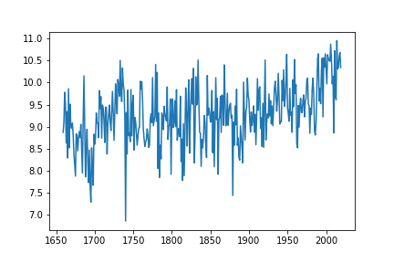

Exercise
Going back to your temperature data plot:
- Save the figure to a file and display it in your Jupyter notebook.